#i found a review that linked to a lot of background stuff
Explore tagged Tumblr posts
Photo
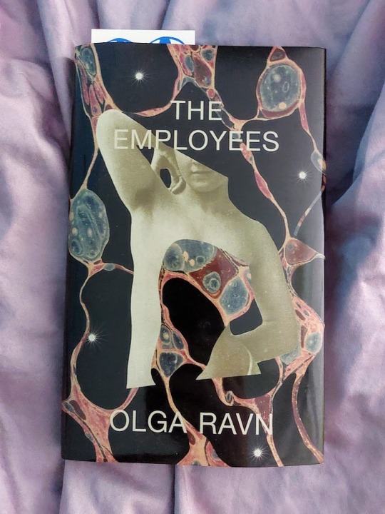
Books of 2023. THE EMPLOYEES by Olga Ravn. This was a very weird, very poetic, reasonably fucked up little book that I’ve had my eye on since it was released in English, and I enjoyed it! It’s one of those hugely ambiguous, “good luck sorting this shit out” type books, told in statements by the human and humanoid coworkers on a space ship (and there are alien artifacts involved).
#books of 2023#books#book photography#the employees#olga ravn#i found a review that linked to a lot of background stuff#(on goodreads i mean)#apparently this was inspired by an art installation/exhibit#i didn't look into it Much but i definitely scrolled through some gallery pictures (without reading the placards or anything) and that uh..#clarified some shit lol#anyway definitely a trip i enjoyed it and it went very fast!!#the hardback edition has teeny tiny pages and text though#(that's the edition i read)#i'm not sure if paperback is much better
18 notes
·
View notes
Text
YOU MUST MAKE A WEBSITE
Oh wow, look at that! YET ANOTHER post urging you to make a webbed site! What a completely new thing that people haven't made a thousand masterposts for already!!
• Making a website might look scary. It is Not.
At first, I too thought making a website was too much work. It really isn't! It turns out that all you need is
an HTML file,
a web hosting service and
w3schools tutorials,
and that's about it!
This post will point you towards these resources, and others I found useful while figuring out how to make a website.
• VERY QUICK EXPLANATIONS:
What's HTML and CSS?
HTML is the content of your webpage, the skeleton of it. What shows up in a webpage is what's written in the HTML file!
CSS is the way the HTML is styled; the colour of the background and the letters, the size of elements, the font, all that!
Do I absolutely NEED JavaScript for a website?
Not at all! You don't need to worry about learning it before getting started.
• What do I make a website for? What do I put in there?
ANYTHING AND ALMOST EVERYTHING. Here's some ideas for pages from a post of mine were I was very normal about websites:
You can make a page that's only pictures of your pets.
You can make an interactive adventure.
You can make your own academic blog full of your own essays or articles.
You can just post a ton of art or make a full music page.
You can make a blog and infodump eternally, give book reccs and reviews. You can host a thousand virtual pets and nothing else.
Upload entire books in a single html file. Make a wikipedia for your ocs. Make a fake site for a random fictional place (restaurant, hotel, whatever). You can make a thousand fanpages/shrines about your favorite media. You can upload your own webcomic and make it all like a fancy website and shit.
I could keep going but, for the sake of "brevity", I won't.
• WEBSITE EXAMPLES!
If I started listing the websites I know, this post would be bottomless. Here's only seven:
https://publictransit.neocities.org/ - A webbed site, for sure
https://ribo.zone/ - A personal site
https://leusyth.neocities.org/ - An art archive
https://solaria.neocities.org/ - Personal website with A Lot of stuff (it'll come up in a bit, because it offers web making resources)
https://hog.neocities.org/ - The Hogsite
https://thegardenofmadeline.neocities.org/ - Another personal site! It also has a web resources page and has made another masterpost like this one (but better)
https://spiders.neocities.org/ - My own website, which must be weird to see in mobile . sorry
• You've convinced me. I want a webbed site. Where do I start?
https://neocities.org/
FIRST OF ALL: Neocities. It is a free web hosting service, and it's the one I and the sites I linked use!
When I first started, my website was a black page with red letters and a drawing, and nothing else! It was like that for a month, till i started picking up on how to do things.
Here's what helped me get an idea of how to make things work:
https://sadgrl.online/learn/articles/beginners-guide-neocities
An absolute beginners guide to neocities -- while when you make an account there you get a tutorial page from the site, this one's extra support for that.
https://www.w3schools.com/
Learn HTML, CSS, JavaScript and MANY other coding things for free. All the tutorial/reference pages have live testing windows for you to mess with!! helped me a LOT while figuring this stuff out!
https://htmlcheatsheet.com/
https://htmlcheatsheet.com/css/
Cheatsheets for HTML and CSS, respectively. It includes a JavaScript one too!
https://sadgrl.online/webmastery/
Sadgrl's webmastery resources! Also includes the next resource listed here:
https://sadgrl.online/projects/layout-builder/
Sadgrl's layout builder; not a lot of customization at a first glance, but I've seen wildly different websites all using it as a base, plus it works using CSS Flexbox, so it generates a responsive layout!
(basically, a responsive layout is one that translates well in different sized screens)
https://www.tumblr.com/fysa/728086939730919424/wikitable-code?source=share
Tumblr user fysa made this layout imitating a wiki page!
https://brackets.io/
At some point, you might want to do things outside the Neocities code editor and get one outside the site. I recommend Brackets, because my old as fuck computer can run that and absolutely nothing else apparently, and it works wonderfully! Though I recommend either turning off the code autocomplete or using it after a good while of already using the Neocities code editor, so you get used to coding on your own.
http://www.unit-conversion.info/texttools/text-to-html/
Turn your text into HTML code! i use this kind of pages for my lengthy blog entries that I don't feel like formatting myself.
https://imagecompressor.com/
COMPRESS YOUR IMAGES.
The heavier an image is, the more your site weighs and the more time your page will spend loading. You don't want that, specially if your site is heavy on graphics. This might help!
https://solaria.neocities.org/guides
Some CSS, JavaScript and Accessibility guides! Worth checking out!
https://eloquentjavascript.net/
This is a free, interactive book for learning JavaScript! NOTE: It is very intuitive, but JavaScript is HARD!! I still haven't learned much of it, and my website does fine without so don't worry if you end up not doing much with it. It's still useful + the exercises are fun.
And now, accessories!
• Silly stuff for your page :]
https://gifypet.neocities.org/
Make a virtual pet, copy the code and paste it in your HTML file! You'll get a little guy in your webbed site :]
https://www.wikplayer.com/
Music player for your website!
http://www.mf2fm.com/rv/
JavaScript silly effects for your site :]
https://blinkies.neocities.org/geoblinkies
Blinkie search engine!
https://www.cbox.ws/
Add a chatbox to your site!!
https://momg.neocities.org/
Infinite gallery of gifs. i've spent hours in there looking at moving pictures and out of them all, the ONLY gif i actually ended up using on my site was a rotating tomato slice. it is still there. trapped.
https://wrender.neocities.org/tarotinstructions
A widget that gives you a random tarot card!
https://www.websudoku.com/widget.php
Sudoku widget!
That's about it for now! I don't know how to end this!!! Remember to have fun and google everything you don't know :]
511 notes
·
View notes
Note
I'm actually bummed about YouTube as a whole bc We're in Hell and Channel 5 both turned out to be rapists and just kept making videos so now when I need inoffensive background noise at work my eyes glaze over and I type in "bossa nova" like literal elevator music is better
tumblr is fucking with me and wont let me post the whole post without telling me why but i think bc of all the links i put its getting flagged as spam lol. bear with me as i update this post
oneshorteye: speed run history vids about sierra games and their ilk. interviews with the creators. https://www.youtube.com/@OneShortEye
anomaly documentaries: short form docs about weirdness in the world mostly prior to 2000. delivery and presentation like a 1990s educational video. not edutainment. https://www.youtube.com/@AnomalyDocs
atrocity guide: similar in tone to the above. not as dark as the name would suggest. https://www.youtube.com/@AtrocityGuide
anyaustin: seeks out mundane, odd, tranquil, haunting, or idiosyncratic areas in video games. sometimes roleplays as a census taker to determine the unemployment rate of video game citites https://www.youtube.com/@any_austin
drripVHS: a hero, a legend. uploads rips of VHS tapes he picks up from thrift stores in the portland oregon area. soooooooo many RLM wheel of the worst picks can be found here. https://www.youtube.com/@DrRIPVHS
taskmaster/bbc shows: a shocking amount of british tv shows are uploaded in full on youtube by official accounts. taskmaster fucking rips lol https://www.youtube.com/@Taskmaster
bobby fingers: irish artist who creates dioramas of famous people and events while collecting an oral history of the event and everything surrounding it. this is underselling his production quality by a lot. subjects include mel gibson's drunken arrest and steven segal getting bodied by gene lebell https://www.youtube.com/@bobbyfingers
danooct1: computer enthusiasts who runs old, weird viruses from the 1990s-2000s on his machines. its funny how many of them were little pranks. https://www.youtube.com/@danooct1
primm's hood cinema: funny guy reviews hood movies. simple as. https://www.youtube.com/@PrimmsHoodCinema
treytheexplainer: history nerd (history student?) explains really, really, really, really, REALLY old stuff. but funny stuff. https://www.youtube.com/@TREYtheExplainer
ann reardon and how to cook that: an aussie mom who creates frankly astoundingly beautiful confectionery creations. started to debunk dangerous 5 min craft vids after becoming alarmed at their proliference. also shows how to fix your busted ass cakes and explains why they fucked up. https://www.youtube.com/@HowToCookThat
MEpearl: i love georgette i would move heaven and earth for her and her opossums she rescues. shes insane (strongly positive) https://www.youtube.com/@MEpearl
tara a devlin: some aussie who translates and plays obscure horror games of varying quality from japan. VERY obscure and weird stuff. fun. https://www.youtube.com/@KowabanaJapan
187 notes
·
View notes
Text
besides the obvious facistic implications one of the biggest bummers about the tik tok ban to me is losing a really big source of indie muscians. so in (anticipatory) remembrance here are some i found on there that i think you should listen to!
my qualifications are that i once had a 94% rating on obsurify and i listened to 54k minutes of music last year.
all links lead to spotify.
pop
shallow alcove: they had the most beautiful, aesthetic content on tik tok i've ever seen. i will miss all their covers forever. a mix of bedroom pop and folk. (song about nostalgia) (people pleaser anthem) 117k monthly listeners on spotify
nemahsis: very dreamy pop music, i dont know if this is true but there are harp vibes. (good first song) (another) 300k monthly listeners on spotify
khatumu: for everyone whose ever wanted a song about being taken out back and put down like old yeller (another good song, more folky) 43k monthly listeners on spotify
madisinn: more dreamy bedroom pop with some grungey undertones (my favorite)
folky/acoustic
school house: a classic plunky folk band. they also have some more typical indie pop stuff. (a folk radiohead cover) 17k monthly listeners on spotify
rebecca rea: she wrote a beautiful love letter to appalachia 8000 monthly listeners on spotify
june henry: very pigeon pit esque, which is one of my favs. they make a lot of very short songs if that's something you're into. (queer) (sad) 41k monthly spotify listeners
ducksmithson: calls themself "folk-ish", found them from an unreleased song they made about challengers that i'll miss forever. very diy (good first song) 438 monthly listeners on spotify
a bit more pop and sadder
hannah mundine: soft, beakup songs with "roots in folk, indie, and contemporary pop" (my favorite) 10k montly listeners on spotify
wesley preis: think phoebe bridgers here, she makes similarly somber music with the same post adolescence themes (good first song) (my favorite) 4000 monthly listeners on spotify.
country
clementine was right: if you like country and you listen to one thing on here make it clementine was right!! i love their stuff so much (good first song, very country) (less country alternative) (my favorite) 697 monthly spotify listeners
lana nauphal: hippie music with a bit more of a background twang 394 monthly spotify listeners
mae valerio: a stereotypically country cover of motion sickness by phoebe bridgers, it works though 3000 monthly listeners on spotify
alternative/misc
nussy andrews: i dont know how to describe her music but i love it a lot, lots of violin and piano and very viseral lyrics and vocals (good first song) (my favorite) 4000 monthly listeners on spotify
insert title policy: a review called him "retro, a cross-transplanted hybrid of 80's indie rock and Goth pop". (good first song) (my favorite this whole album is beautifully tactile, you should listen to it) 164 monthly listeners on spotify
rookie mistake: a classic, ive gotta get out of my home town type song that i like a lot. starts very acoustic but switches up halfway 737 monthly listeners on spotify
disclaimer: i don't know music genres like that so if it's not in their spotify description they are cateorgized mostly with vibes.
#this post is so long sorry dkjshs#if you think my music taste is terrible dont tell me <3#tik tok ban#music recs#song recs#indie music#rip to all the girls in their bedroom making indie pop that i will lose with the tik tok ban i loved yall even if you never released anythi#g#long post
5 notes
·
View notes
Text
ryan ross iceberg (tier 7)
tier 1, tier 2, tier 3, tier 4, tier 5, tier 6, tier 8
deep waters:
light up skechers fancam:
this is a fancam made by twitter user fleetwood_wac. the background song is skechers by dripreport, and i think it was a tiktok song? (i don’t have tiktok) in 2020/2021, it became famous on ryan ross stan twitter. i don’t think the original tweet is still up, but aryn has it in this reply.
side note, if you weren’t on ryan ross stan twitter in 2020, you were sorely missing out.
go figure. to late honey:
this is a quote from one of ryan’s livejournal posts from july 3, 2005. it’s SO iconic.

zrosswald:
this refers to ryan/z berg/alex greenwald. i think it’s meant to refer more to their friendship; the golden trio, if you will. however, i’m sure there are people who genuinely ship them all together, just like rydan.
they have been a tight group for a while, as z and alex both played with the young veins some. also, ryan and alex made appearances at z’s prom events.
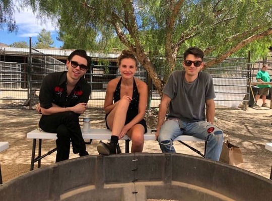
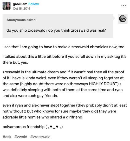
eta: as i suspected, this is definitely a real ship.
here's a tumblr post explaining the ship dynamics a bit more. this blog has a lot of zrosswald content if you're interested!
kale:
on thanksgiving of 2011, ryan tweeted this:

in 2021, it became a meme in the ryan stan twitter community, and people tagged gordan ramsay in the tweet, asking his opinion on ryan’s cooking.
first male model for mac:
the story goes that in the fever era, the makeup company mac offered ryan a spot to be their first male model. unfortunately, he declined. according to the comments on a livejournal post i found, ryan discussed this in a 2006 spin magazine interview [i]. there were scans of the interview, but sadly, they’re not available, like most pictures on lj. it hasn’t been archived either.
the same commenter says that article doesn’t specifically mention mac, though. mac did offer ryan free products, but he doesn’t say if he accepted them [i].
so, it’s unsure if ryan was offered to be mac’s male model (unless there’s another source i’ve missed) or another brand’s. either way he turned it down. my guess is that the mac idea came from the fact that he used mac’s products back then.
beef with pete wentz:
after the split, brendon got pete in the divorce.
in a MTV interview that ryan did in 2009, it says “…he wishes Urie and Smith well and still considers them both to be his friends…The same cannot be said, however, about his former boss -- Decaydance Records honcho/ Fall Out Boy bassist Pete Wentz -- who seems to have clearly aligned himself with the Urie/Smith camp following the split" [ii].
in the same interview, ryan specifically says:
"I haven't spoken to him in a while, since this happened. I guess I've been meaning to call him back. He called me, but I've missed a lot of phone calls this week," Ross said. "We're not sure [whether Ross' and Walker's new band will be on Wentz's Decaydance Records]. I'll have to talk to him, but obviously from what's happening online, I think he's ... he's written a lot about them. I don't know if they're working together on their stuff. I'm not really sure, but it's been awhile since we've spoken. It's strange. It's kind of weird" [ii].
the author of the article speculates that ryan and pete’s friendship is over [ii]. i can’t find the source for this, nor can i remember what the specific comments were, but i swear that pete did make some shady comments about ryan at one point.
however, it does seem that their relationship is not on negative terms currently. in 2016, pete tweeted this and this about ryan [iii] [iv]. also, this year (2023), pete mentioned ryan in a video fall out boy posted of pete reviewing his old fashion! you can watch it here:
instagram
i’m also going to link an article i found that chronicles ryan and pete’s entire relationship, which is an interesting read (although i get the feeling they’re a little biased against ryan…).
ryan’s pet turtles:
i can’t find the post or comment, but on a lj post, ryan commented “this reminds me of when my dad ran over my pet turtles with the lawn mower. thanks.”
“i went to high school with ryan:”
i have two sources for this, and i’m not sure of which one is the original. however, this one is the one i remember seeing first (around 2014).

on tumblr, someone sent in an ask saying essentially the same thing, also in 2014.
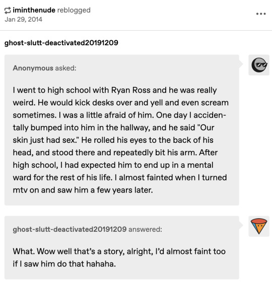
i know that both are referring to the same thing; i’m just not sure if the first pic is based on the ask, or if the ask is based on the image. either way, the sentiment is the same.
honestly, i don’t think this story is true. still funny nonetheless
hot girls eating pizza:
this is another one i cannot find a source for anywhere (not even a tweet mentioning it), even though i was able to in the past. i apologize.
but i’m pretty sure that what this is about is a tweet/social media post in which he referred to hot girls eating pizza.
if anyone has a source or more information on this one though, please let me know!!
(i was going to dm the creator of one of the icebergs i referenced to ask her, but twitter won’t allow me to send dms to someone who doesn’t follow me unless i pay for twitter blue. i’m committed to explaining this iceberg but not enough to give elon musk my money i fear)
sent to an island:
in an alternative press interview from 2018, z said that on christmas eve, she shipped ryan off to an island to clear his head. ryan says, “true story” [v].
kate moss playboy:
in the following picture from ryan’s instagram, you can see a kate moss playboy on the table.

hentai:
in the fever era, panic did interviews for a japanese magazine. someone ran ryan’s portion through an image translation, and it brought back something about hentai.
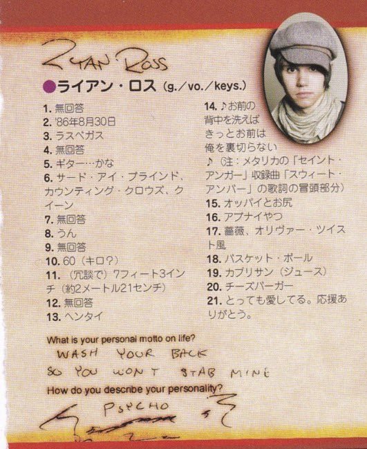
eta: update, twitter user givememallce bought the actual magazine from japan and provided us with translations of this image and the questions the band was answering! they also included the answers from the rest of the band if you're curious about those [vi]. so the biggest shoutout to them and their service.

fake wedding with z:
in 2009, ryan and z pretended to be married. ryan tweeted a picture of z with a wedding ring, called her his wife, and also tweeted a quote of her calling him “the best husband ever” [vii].

later, he tweeted that his wife left in the middle of the night. he then had a revelation:

the best part is that all of these events took place within a single day.
here’s the masterpost with all the details:
not actually 5’11:
this is a conspiracy that ryan is lying about his height.
one piece of evidence was that brendon is 5’9, meaning ryan would be 2 inches taller than him. however, in a lot of photos they look to be relatively the same height.
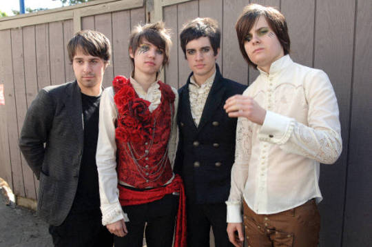
the other piece is that multiple fans who have met ryan said that compared to their own heights, he can’t be 5’11. i don’t have specific sources of people saying that, but i know it was discourse on twitter at one point.
next is the final entry in the iceberg, where we get into the most obscure stuff the iceberg has to offer and finish this thing up.
tier 8
references:
[i] https://bandfandom-ref.livejournal.com/133181.html
[ii] https://www.mtv.com/news/1fedpk/exclusive-ryan-ross-talks-about-leaving-panic-at-the-disco
[iii] https://twitter.com/petewentz/status/794988164901261312
[iv] https://twitter.com/petewentz/status/795025751930114048
[v] https://www.altpress.com/ryan-ross-z-berg-the-bad-list/
[vi] https://twitter.com/GIVEMEMALlCE/status/1695649402663363028
[vii] https://pathetic-at-the-disco.tumblr.com/post/180912208431/ryan-ross-and-z-bergs-wedding-masterpost
#ryan ross#ryan patd#panic! at the disco#panic at the disco#patd#jon walker#ryan ross iceberg#brendon urie#spencer smith#the young veins#i know i said updates were gonna slow down but im trying to finish this before the semester gets too hectic#this didnt take as long as i expected because there's not much to say about most of these entries
36 notes
·
View notes
Text
FIPTION: There Is A Crack In The World (Review)
So, I finally finished "There Is A Crack In The World", the largest part of my fiction reading trade with @fipindustries. It's taken me a while, and I haven't spoken about it much here as I read, sending my in the moment thoughts to Fip directly, instead. Part of the reason I didn't finish it sooner was because I am abroad, and I've been distracted by not being in my own home, hanging out with my boyfriend, actually hanging out with Fip in person, but regardless; I am done now and here are my thoughts.
Crack in the World is a really interesting book for a lot of reasons. There are a bunch of things I didn't like about it, and a bunch of things I really did like about it, and it's fascinating for me how those things intersect. I'll start with my biggest criticisms; the writing itself is very one-and-done, unedited prose, which, combined with this being a novel written in a second language, results in text that feels fairly sloppy in parts, spattered with spelling and syntactic errors, odd sentence phrasing that needs a second eye making adjustments. There are some moments where I can feel the author had a clear picture in her head, but where the details didn't come out as clearly as might have been liked to the reader. These issues would be the biggest barrier to this getting published properly one day, but it's also arguably the most straightforward to fix; the book just needs a thorough editing pass, either by Fip or another editor. The intent is clear enough that I think someone could fix up these issues without any author input, and indeed I found myself doing so in my head as I read. The core meaning is solid, and so when thinking about the book I am going to largely ignore the typographical stuff, the narrative now feels fairly accurately transcribed into my head where I can prod at it as a consolidated story, and it is that story that I'll be reviewing.
The important context for CitW is that it was written when the author was, per her description, dealing with having been in a pretty bad place, and so the tone that the novel seeks to strike is a pretty grimdark one. According to the aftermath post linked at the end, parts of it were an exercise at writing "unrepentant misery porn". Maybe I am desensitised to dark fiction, but a lot of the book didn't really come off that way to me, but in a way that's almost to Fip's credit; even when she's trying to write a dark and miserable story, Fip's delight in writing about whacky characters playing out dynamic adventure narratives comes through in many places, and so the book's dystopic setting feels more Mad Max than 1984. The setting is dark and grim, but it's a cartoonish kind of grim that is, to be frank, mostly just sort of fun. There's a teenage edginess to a lot of it, which Fip has talked about being an accurate description of the mindset for some scenes. The times when that edginess doesn't work are, ironically, when the book really tries to be dark but in a way that pushes into being too crass to be endearing. There's a lot of blood and gore, which I appreciate, but then there are anal rape and shit jokes, which I do not, it feels a little bit too immature and too aspirationally edgy. I think some of that is regretted in retrospect. It doesn't detract too much from the overall feel, though.
The plot is also surprisingly straightforward, not as labyrinthine as I had expected at its core, a fairly conventional dual-protagonist adventure arc culminating in crossed paths (with several side-vignettes, as I discuss later). The ending is dark and follows up on the themes of hopelessness the most effectively of anything in the novel. After the entire book, I think that the background thematic radiation has built up enough for it to be earned, by that point. The final chapter and epilogues are a little fast and blunt, but not unworkably so.
There are two big strengths to the book, two things that I really liked. The first is the characters; Fip is primarily a visual/comics artist and you can really tell, even via writing alone, that she really likes coming up with cool characters with their own specific emotional vibe, and setting them off to interact with each other. These are guys who all feel like they should come with their own splash screen, tag line and iconic halloween costume. There's something almost superhero comic strip about the iconic identities of the characters, about their specific skills and motivations, true even for those that don't actually have their own "superpowers". But don't get me wrong, there's plenty of superhuman individuals on display, here; we have impossibly tenacious gun-wielding assassins, murderous, practically invulnerable clown girls, jungle mercenaries using anti-air rifles as a personal pogo stick, Russian mobster types, a literal dark lord... It's very whacky and fun when you get down to it, which is what really tempers the intended grimdark tone. You might fear that there's some dissonance there but it merges into something unique and interesting. That said, perhaps a more tightly edited version could change some passages with that in mind.
The second thing I really liked was that the story is used as a sort of... Stage setting for a bunch of smaller, more contained narratives, almost smaller parables (sometimes literal parables) that slot into the story. These are clearly separate ideas that were floating around in the author's head, and a lot of them are more tightly written than parts of the main narrative, more fully formed from the start. The two interlude chapters are the clear standouts in the whole work, and both are examples of writing in the style of these little vignettes. I do almost wish that the rest of the story was more integrated to match, there is a risk a few times of the non-sequitur insertions coming across as a little piecemeal, but this becomes less of an issue near the end - the second interlude is at once its own thing but is deeply connected to the rest of the story, and it makes absolute sense that it comes when it does.
One thing that the vignettes also highlight is the difference between pre-planned narrative trajectory/pacing and the "write on the fly" nature of the rest of the novel. There are some times where, in comparison, the "standard" chapters are at risk of tripping off required plot occurrences by rote without dwelling on them, and it's most notable by contrast. Keeping the little sub-stories in the novel is well with it though, and the pacing issue could be fixed with editing.
Other little things I liked: the bounce back and forth between protagonists in alternating chapters was very fun, and helped keep the pace up. I liked seeing the world from different perspectives, and from characters with very different roles in the world. For that matter, I liked the world itself; the worldbuilding was fun, if a little tropey, and I enjoyed trying to dissect the lore. There were a few things that didn't hold up to scrutiny lore-wise in retrospect, but that's understandable given the serial publishing. On the other hand, there was a lot of cool thematic stuff and character foreshadowing that was clearly planned well in advance and paid off really well. I'm avoiding specifics due to spoilers, but there are a lot of fun surprises in this novel!
So that is There Is A Crack In The World. Not a perfect book by any means, but a lot of fun and vibrant ideas. Fip has been sending me her excellent artwork for the story, which really adds a lot, and that compounds my desire to see this adapted as a sort of pulp graphic novel, given an ideal world. At it is, if there is future development of the story to be had it would be in a thorough editing pass. This is not required, however; the story is a fine artefact as it exists on its own, as rough around the edges as it may be, it tells an interesting and satisfying tale of some very cool characters. It's a shame I didn't get through it faster, but I'm very glad I took the time.
Great job Fip. Next up I read The Milkman (although that may also be slow coming; my preemptive apologies).
10 notes
·
View notes
Note
Exactly! I think exposing yourself to new music even if you end up not liking it is a huge part of learning what you do like too! (Also it's super cool that you're looking for inspiration for your own band!!)
Prob my last little batch for ya bc I'm at work:
Do It All The Time by IDK How
Ghost by Confetti
Lowlife by Poppy
The Moss by Cosmo Sheldrake
Wasted Summers by Juju<3
This is Love by Air Traffic Controller
Do It All The Time by IDK How But They Found Me
The distortion (I believe its tube distortion I very well could be wrong though) on the vocals throughout the song felt like a bit too much. The melody didn't go anywhere, but it had a good beat. I have heard this song before and I don't think its one of the band's best. I don't really like this song much, just sounds produced for the radio. 5/10.
Ghost by Confetti
Sorta plain, sounds like a lot of songs I've heard. Definitely has a good beat, but not much going on with the song musically. Was enjoyable to listen to but again, it sounds like a lot of other songs out there, especially from the mid 2010's. 6/10.
Lowlife by Poppy
I have a love/hate relationship with Poppy. I have a few of their songs favorited. This is not one of the songs of theirs I like. I do enjoy how her voice is the melody for this song against a backtrack, but their voice is mixed far infront of the backtrack. It drowns it out. And there are times where their voice just stays on one note, which is a little painful to listen to. 4/10, kinda hurt my ears.
The Moss by Cosmo Sheldrake
Didn't like, its spreading false information with the first lyric. Moss does not grow on the North side of trees. …fjrdkghsjkl Sorry I had to say that. XDD Anyhow, I enjoyed the up and down feel of this. I felt like I was listening to a vocal metronome, if that makes sense? Made me wanna tap my finger on the table to the beat. I enjoyed it, but I wouldn't listen to it again. 5/10
Wasted Summers by Juju<3
This song reminds me of old 90's Blur. The voice singing super off key in the background was annoying and ruined the song for me. Would've been a nice chill song otherwise. Other than that, the guitar rift was alright, nothing special though. 3/10 because of those backup vocals.
This is Love by Air Traffic Controller
The synth in this was very good. I loved the fluttering sound it had going from left to right. The pulsing sound of the vocals really went with the background synth. The singing off beat at the end was off putting though. It came out of no where and took me out of the groove of the song. I think he was doing a 1/2 meter against a 4/4 which was just strange sounding. (I don't know if those are the correct meters, but I did my best trying to analyze them) 5/10, it was alright.
No seriously, this type of stuff can be imperative as a musician. If I only stew in things I constantly listen to, that's damning myself to stagnate artistically. And thanks! My band's called Scent of Steam. I just released my first album this April and I've got a new single coming out on Sept 30th.
If you're curious, here's the link to my album. You can listen if you so desire, but nbd if not.
Thanks again for the songs! I enjoyed reviewing them.
2 notes
·
View notes
Text
Week 3: Local Competition
Anastasiia KWebsite Experience: The website experience was very easy and straightforward. She had three price ranges (Basic, Standard, and Premium). After selecting one, you log in (using a new account or a google account) - fill in some details and pay. You can also contact her for more information, however response times are usually 6 hours. Marketing Positioning: Anastasiia art is soft in aesthetic compared to other artists yet it is clear she has more dedication to the craft considering she not only does lineart - but also colour, shading, lighting, backgrounds, and more. I have seen others do soft art like this. But hers has a uniqueness to it. Reviews: Reviews are mostly 5/5. No 1’s or 2’s. From what I’ve seen, these people love her for her whimsical and somewhat child cartoon style. One person got their order a day early but was not impressed. They claimed that her art was a lot chalkier than what was promised in photos.
Pricing: Pricing differs depending on what package you get. For example, in one of her gigs: Basic 5 day/2 day: $28.33/$56.67 Standard 5 day/2 day: $42.50/$85.00 Premium 5 day/ 2 day: $70.84/$113.34 Overall, a lot of her prices are near $28.00
Social Media: From what I’ve gathered, she does not use other social media nor has any links to other social media. This is a big bonus on my end, considering my marketing strategy is using as many platforms as possible in order to gain traction! Anastasiia
Website Experience: Same as before (considering this is being used on Fiverr just like the first one). Easy to navigate - has three price ranges: Basic, Standard, and Premium.
Marketing Positioning: This Anastasiia focuses more on fashion concepts and food. From what I’ve seen from her portfolio she does things such as: Detailed foods, jewelry, portraits, clothes, and tattoo designs.
Reviews: Again, five stars. From what I’ve read - she’s incredibly responsive and does excellent work. One slight drawback, however - is that it takes her time to understand her customer’s vision of what needs to be drawn. There was one two star yet it was too vague to understand what the problem was.
Pricing: From what I saw from her gigs, a lot of her gigs are around $15. Her most expensive is $48. Though all these prices vary from what bundle you’re purchasing from (Basic, Standard, and Premium)
Social Media: Perhaps it's just Fiverr, but it seems like there’s no link to other social media. I doubt that these artists only use Fiverr - I’m sure they have other social media that they post on, yet because they cannot link it in Fiverr I am unable to know if they do.
Missyozart
Website Experience: Same as the other two, easy to use and straight to the point!
Marketing Positioning: Whereas the other two were based on coloured/softer aesthetic, Missyozart is the complete opposite. She does stuff harder line-art that is usually in black and white. Very tattoo-like and gothic!
Reviews: Reviews are mostly positive with a couple 1’s and 2’s here and there. What she does well is being able to deliver quickly and go above and beyond. Though she is able to deliver quickly, from what I found from the negative comments - she is not good at communicating and sometimes doesn’t give the customer what they ask for.
Pricing: A lot of what I saw was around the $50.00 range, where her most expensive work is $78.00 - this is due to added colour.
Social Media: Same as before, no social links coming from here which is odd. I’ve looked up if Fiverr is able to link different social media accounts for people to look at, and it says it can. I wonder if that is not the case.
3 notes
·
View notes
Text

January As usual January started slow. Apropos of nothing, I decided to draw this anthropomorphized Musharna (from pokemon) and she's so sleepy, she has a plush Teddiursa. I think that's cute.
February And so begins my art this year, mostly being art for my various youtube videos. It's kind of amazing I made the video this is for back in February. Only this week, at the time I'm writing this, I've been working on a variant of the deck it's about, and won a clean game with it. Jalira is really cool. Shame 'Cold Brews' didn't go anywhere. I liked the idea for a series, but I guess it was too slow. Who's to say more, maybe if I'd done more one of them would have caught fire. (I didn't even end up using this as the thumbnail since I wasn't sure anyone would pick-up what it's about.) March This one is an exception to my usual rule. I always use pictures actually on DeviantArt, and its an easy rule considering just before posting this year in review I added some pictures I missed, but this is but one of a group that, while I think embody the month, I don't really think need to live on dA. This, and the other images I made with it, were for my April Fool's video, so they weren't even shared until then, but were definitely drawn in March. April I loved the video this was for so much! I wrote some short fiction, and gave it a dramatic reading. I made a mechanically interesting card that combined these two beloved magic characters, and I drew this picture, which is one of the few drawings I did this year in this specific style, which I kind of think of as my signature style, despite not using it much in 2024. May There are surprisingly a lot of good may pictures, but I had to give it to my boy Amnesio. One of my favourite pictures of the year, regardless of context, they're also the face of one of the years best received videos.
June June was Splatoon-June, one of the weirdest daily art projects I've done, because the art was actually secondary. Instead of challenging myself to draw a picture every day, I designed a magic card, made art for it, and recorded/edited a short video about it. This was just one, but click through to the linked picture if you want to see the entire month of art. July Like with Amnesio in May, this was drawn for a very similar video, and I really tried to match the level of quality I did for Amnesio with this one. Interestingly this is actually the third in the series, the second one came out in June, but I never posted the art because it just didn't come out super great. This one though... I like this one. August These weren't the only options for August, but I love these little weirdos. I think my best work is when I go simple and stylized, but I tend not to include them in stuff like this, because they aren't the most, obviously impressive. As I've said about other pieces in this review, these guys are the face of one of my better performing videos of the year, so they have that going for them too. September And here's Morrigan, my girlfriend's most important OC (to me and our relationship, I can't speak for her.) I haven't drawn her in a long time, but she's always in the background of our life. For her birthday I decided to draw Morrigan and make a magic card for her, and this was the result. I tried to keep it relatively stylized, while still putting in the extra effort to make it feel special. There's a bunch of fun techniques I used in this that I hope to use again in the future, like the post white outline and the way the background came together. October I couldn't not use my October daily drawing challenge for October, but this year I went so stylized with it, one drawing wouldn't do. So here's the end of October summary picture for you to peruse. I highly recommend clicking through to the video as well since it includes a very cute scene that a fan made using them which I found incredibly touching. November I feel like not that much happened in November, I ended up getting very busy and the only really good picture from that month, I didn't even remember to post. I just put up this piece today in preparation for my Year in Review, so here it is. I like Taya, she's fun. Not a very complicated design, but a cute one. December And finally December. I didn't make this piece because I was overwhelmed, but it works well for it. December is always busy, and this year was no exception so it's a very fitting image.
I love doing this series, not just because it gives me an excuse to look back at all I've done, but during the year it makes me remember to do at least one noteworthy thing a month so I don't have any empty spaces at the end of the year.
Happy New Year everyone, here's to another one.
1 note
·
View note
Text
7/11 updates! + "Last Night Zelda" teaser!
Well, it's July! And through some miracle, I'm still alive! The summer has been a lot busier than I expected (I made way more trips back home than I planned on making) so needless to say I have not done a lot of writing, lol. Oh well! It happens. Life be like that sometimes.
I'm working on "Last Night Zelda" as we speak though!!! I would like to get it finished up before the end of July so I can focus on my fics for AgneKari Week (only a month away!!!!), but I'm also moving to a new apartment at the end of the month and that will be a...fun time. I hate moving. It always reminds me of how much stuff I have xD I am excited for it though. Definitely ready to move.
In the meantime, have a little snippet of "Last Night Zelda", a modern au TP Zelink fic!
A flood of memories crashed into Zelda. She had been in her office reviewing paperwork for next week’s council meetings when a maid came by with a delivery: a gift basket from a new suitor. Said basket included a letter of the man’s intentions to pursue her, along with a box of chocolates and a bottle of her favorite wine. She meant to put the letter aside and deal with it when the weekend was over, but something nagged at her to open it. It was dreadfully boring and pretentious, as most letters of courtship were. But by the end of it, she was sobbing, head in her hands as tears streamed down her face. Reading those words of affection, she’d found herself desperately wishing that they’d been penned by a different man. By law, any citizen of Hyrule was permitted to pursue Zelda. The days of political marriages were long past, even if her father had attempted to settle her into one before he passed. All one had to do was submit a request to her council, who would do a thorough background check before approving the request. From there, the prospective paramour would announce their intentions to Zelda herself, and it was up to her to accept or decline. She’d received offers from CEOs, politicians, and celebrities. She’d received offers from heart surgeons, professors of political science, and news anchors. She’d even received an offer from the castle librarian’s son who was ten years her junior. But never had she received an offer from the blue-eyed bodyguard who snuck his way into her every thought. That had been the breaking point last night: the fact that no matter how much she wished it, how desperately her heart and soul desired it, Link would never pursue her.
As always, have a great day!
-Hy♥️
0 notes
Text
Some posterity that things are actually happening and I am not a big mess I am just a little stressed but things are going to be all just so completely alright
I thought I would send another email update because I think the last one might have been a month ago where I had to send the awful news about my partner's mum.
Since then, we've had Sharree's funeral. I was being very optimistic when I thought I would need "a few days" to be there for Sean. This has been the first death of a loved one (sans my dog) that I've actually been close to so I wasn't prepared at all for what the process is like. Not in terms of the emotions or in terms of the legalities you have to go through. Sean is his mum's sole child so there is a lot of documentation, a lot of figuring out what happens next with her home, her debts, etc. For Sean too, he is currently a student and not working, so there is no financial float to carry him while he is working through all of this.
I'm happy to say that, outside of that, the PhD is starting to make its way back into my life. Danielle organised two "accountability writing days" where I continued to edit my scoping review which was an affirming way to see that - yes, actually, this research is worthwhile! Outside of that, I have jumped back into Netnography, which is part 1 of the research going forward (I will re-attach our visual timeline here for reference).
I've found some more videos that are inspiring research questions. I have re-issued the Netnography "manual" from the library to start being more structured about my process. I also spent a little bit of time watching more videos about Netnography - specifically https://www.youtube.com/watch?v=IBBQixBe3i8&t=1573s this last night which offered a background context to the theorist Kozinets himself. Netnography was first implemented to aid his research into fan culture - which is the essence of what we are doing with virtual pet research, so that was affirming to hear. He also considers Henry Jenkins to be a lifelong mentor, a name I am sure Allan will know very well. :-)
As a fun extra for you Allan, I have started to knit while I listen to videos as it helps me to listen better. I don't suppose you know which beloved student of ours inspired me with this new hobby?
- We have mentioned my Tumblr previously where I vomit ideas and mostly am just self-effacing. If you still think it would be useful to have the link to that LMK. I can't add you to my Discord server where I do PhD things because it is also where I do work/life admin and I would rather that be separate!
- I am finally reading 'Do Androids Dream of Electric Sheep' and thank goodness I am because it would have been embarrassing to not include it in the PhD somewhere. The entire side plot is the protagonist feeling angst at his virtual sheep not being as good as an authentic one. Meanwhile, the overarching question is, does it truly matter at all?
Enough from me for now. Actually, one more,
Is there a preferred Overleaf template for me to begin writing my stuff in relation to netnography?
0 notes
Note
hey sam! i don't want to dump a research question on you, but just in case this is your remit - do you have any apps or browser extensions or similar for adhd and studying? i know about screen tinting and white noise, but if there's anything out there (paid or not) that you recommend, please wax lyrical! i'm collecting a doc of links for study tools beyond pomodoro style apps!
Man, screen tinting and white noise is already well out ahead of me, Anon :D I never did either of those while studying. I can't deal with screen tinting, but I did eventually start using ASMR videos as white noise when I was in my thirties, when I was working. Lo-fi beat music (often designated FOR studying on youtube!) often helps. Other than that I'm afraid I don't have any tools to link to -- no apps, no programs, no sites. I simply don't use any for learning/studying. I have a lot of tools but they're for managing personal life and very finely-tuned to me, so it's stuff like using google sheets to keep my calendar, and using Tasks to manage my chores. It's not to say you can't or shouldn't use apps and extensions, it's just not something that existed when I was in college and not something I make use of now.
My work, while very focus-intensive and intellectual, and involving synthesizing a lot of data, is also very temporary -- the data arrives in my brain, is put to use, and then goes immediately back out again. I've actually trained myself to have no long-term memory for some things, which is probably a bad thing, but every job I've had since 2008 has involved remembering very specific data for somewhere between five minutes (answering phones, remembering names) and two days (building a profile of a donor).
My study techniques when I was in school were less about environment and more about structure -- how I built my lecture notes and how I transferred them to a method for study.
In class, I found it helpful to take notes on blank paper, unlined, so that I could draw pictures and diagrams and structure my notes in a less linear fashion than lined paper would have encouraged. I should dig some out and take some photos sometime. So I had this artist's 8x11 pad of paper with diagrams and outlines and paragraphs all over the place. (I also tried graph paper but didn't like that, too much visual interference.)
I would start reviewing my notes for the eventual exam pretty soon after taking them -- about a month after any given lecture I'd go back to my notes and start review, which sounds a little insane, but was for me super helpful. I would get a deck of 3x5 cards and start moving what I thought were the vital points from those month-old notes over to the 3x5 cards. I didn't use them as flashcards (except for Latin class), I just put notes on various cards when they seemed to go together, and I'd carry the cards around with me and take them out and read them over. It made them very portable! And it meant that I could study in small chunks across a long stretch of time, which probably was very ADHD-compatible because it meant I saw everything a lot and it became "background noise" in the sense that I retained it.
I did kind of have the classic "gifted child" habit of not studying much because I rarely needed to, and for me that fortunately did carry over into college and grad school. With a few exceptions, I didn't have to study much for my exams, and the index cards covered what I needed. The struggle that I had was writing papers -- the classic ADHD "can't get started, hyperfocus once I do". I did eventually figure out the pattern, and so what I'd do was just block out the weekend before the paper was due (often I set the due dates ahead of the real ones in my calendar) and sit down and do the whole-ass paper across about 18 hours. If I knew the time was blocked out for it ahead of time, then that would propel me into actually getting started, and I'd bang the thing out.
So yeah, a lot of my study techniques for living with ADHD, not that I knew I was, came down to stretching studying way out over several weeks to months, and compressing paper-writing into weekends.
But also like...IDK man, cut yourself a lot of slack, I was studying and writing papers before smartphones existed, before my undergrad campus had wifi. If I wanted to check my email, because I didn't have a computer freshman year, I had to go to the computer lab across campus. It made research harder, of course, but it stripped me of a lot of opportunities to goof off. And because my brain was never trained to expect instant digital gratification, I never had the urge to put my notes down and check my smartphone.
So, maybe there's that, too -- if you find that while studying you get distracted a whole bunch, it may be useful to do some digital "hygiene" -- train yourself to go stretches without checking your phone or your browser, starting small and moving up to five, ten, fifteen, sixty minutes. I can't say that will help everyone or even be possible for everyone, but I think it's something to try.
Readers with ADHD (including self-diagnosis), feel free to chime in with the ADHD-centric study tools you use! I'd like to ask that neurotypical people not share their techniques here, only because people with ADHD tend to get a lot of well-meaning advice that is unfortunately not super applicable to the neurodiverse, which can be really frustrating and depressing. And remember to comment or reblog, as I don't repost asks sent in response to other asks. Thanks everyone!
68 notes
·
View notes
Text
Ao3 Tips and Tricks
So I thought I would make a post about some cool stuff you can do with Ao3 and userscripts, and some tips I’ve learned from setting them up for myself! I promise it's not hard, though this is a lot of info. I'm happy to help if I can.
What You’ll Need:
First, you will need the Tampermonkey extension for your browser (depending on what browser you use, Greasemonkey is the equivalent). On Android, you can even run Chrome extensions on mobile with Kiwi Browser! It is easiest to configure the scripts on your desktop and then sync to mobile with Tampermonkey’s cloud sync feature or by exporting the configured scripts and importing in your mobile browser (I will explain how to do this later in the post). If you use any of the tweaks I outline below, be sure to backup your scripts in case your settings are lost.
Once you have Tampermonkey installed, you can get scripts from GreasyFork. The inimitable @flamebyrd also has some great scripts and bookmarklets and has been incredibly helpful while I figured all this out.
Find a script that looks interesting, click on it, and then click “install this script.” Pretty straightforward. Once you have it installed, you can go to Tampermonkey to configure it (only necessary for some scripts) by clicking on the Tampermonkey extension icon in your browser (under the three dot menu in Kiwi) and clicking “dashboard”, then clicking the edit icon next to the script you want to configure. When you’re done, click File->Save.
Scripts and instructions under the cut
Some of my favorites:
Flamebyrd’s Incomplete Works script - fades out WIPs on works listings, and displays the work stats (wordcount, chapters, etc) in red on single works to make it more obvious that they’re WIPs as you’re browsing:
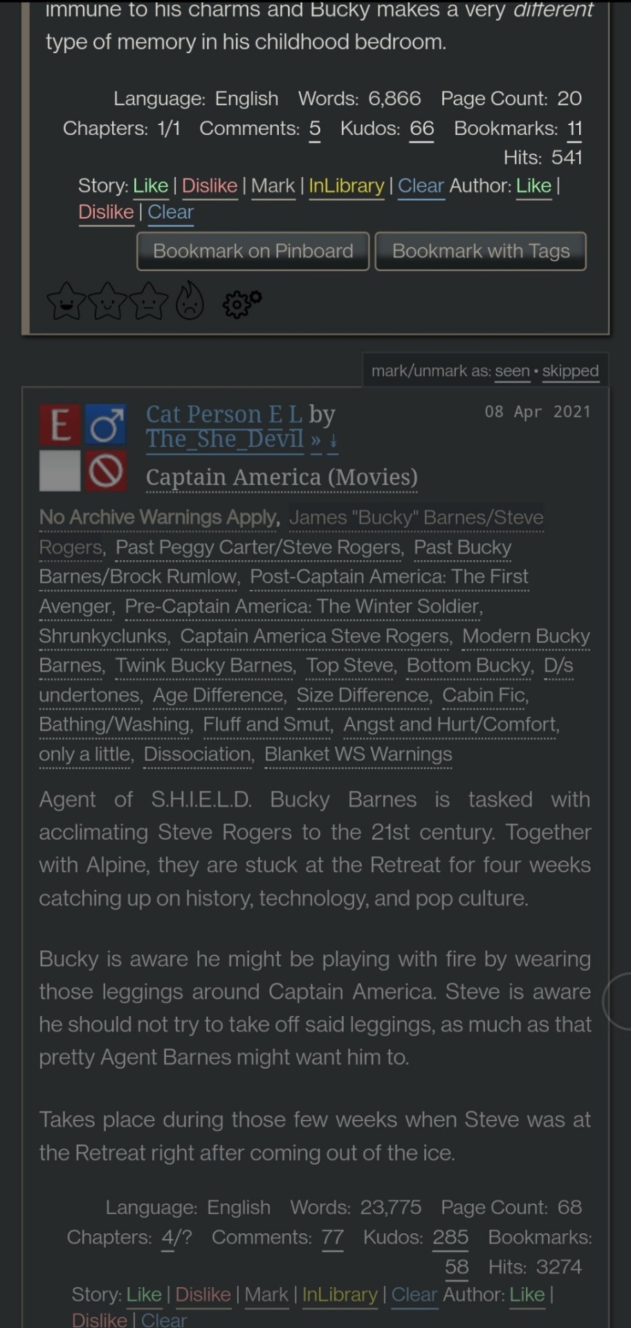
Flamebyrd’s Ao3 to Pinboard bookmarklet/script - if you click the bookmarklet while on a work’s page, it opens the Pinboard save screen and prefills the title, tags, description, word count, etc, and adds ?view_full_work=true&view_adult=true to the URL so Pinboard’s archiver will archive the complete work and not the adult content warning screen (note that Pinboard still cannot correctly archive works locked to Ao3 users, so you may want to download them as a backup. I’ve asked him about fixing that.), based on your selections when configuring the bookmarklet on the linked page. If you use the userscript, it adds a button to the works listings page so you don’t even have to open the work to save it:
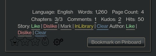
I tweaked this script so that it only grabs the first pairing tag, since I don’t typically care about secondary pairings and they were clogging up my Pinboard tags. It’s a simple fix (though I know nothing about coding so I had to do some googling and inspect-sourcing; kinda proud of myself tbh):
Just change this part of the script
if ( options.relationship_include ) {
- $(".relationships a.tag", $work).each(function () {
To this
if ( options.relationship_include ) {
- $(".relationships a.tag:first", $work).each(function () {
I also found this cool mobile-optimized Pinboard bookmarklet called Pincushion and combined it with Flamebyrd’s script. Everything works except the auto-tagging, but I’ve reached out on GitHub to see if he can help (according to Flamebyrd, there’s no tag field ID attribute to map to). However, this bookmarklet has tagging autocomplete features that make it easy to tag manually. For example, if you type “steve 21st” it will suggest “steverogersvsthe21stcentury” rather than having to type out “steverogersvs…” in order for it to autocomplete like it does on the regular Pinboard bookmarklet. I actually have two buttons set up (which you can see in the next screenshot) - Flamebyrd's to quickly grab the tags and close without me having to do anything, and then the Pincushion one to quickly edit the tags. If anyone's interested, I can explain how to do that.
To combine Pincushion with Flamebyrd’s script (so it works from the Ao3 works listings page as mentioned above), simply change this part of Flamebyrd’s script:
t = t.split(" ").join( options.space_replacement );
var pb_url = "https://pinboard.in/add?url=" + encodeURIComponent(q) + "&description=" + encodeURIComponent(d) + "&title=" + encodeURIComponent(p) + "&tags=" + encodeURIComponent(t);
void(open(pb_url, "Pinboard", "toolbar=no,width=700,height=350"));
To this
t = t.split(" ").join( options.space_replacement );
var pb_url = "https://rossshannon.github.io/pincushion/?user=YOURUSERNAME&token=YOURAPITOKEN&url=" + encodeURIComponent(q) + "&description=" + encodeURIComponent(d) + "&title=" + encodeURIComponent(p) + "&tags=" + encodeURIComponent(t);
void(open(pb_url, "Pinboard", "toolbar=yes,width=600,height=700,left=50,top=50"));
You’ll need to get your API Token from your Pinboard account and plug it in where it says YOURUSERNAME and YOURAPITOKEN (number part only) above.
FanFictionNavigator - mark fics as Like/Dislike/Mark/InLibrary, highlight with colors based on which option you select, hide/show based on category, like/dislike author and highlight with color. Only you will see how you've marked things.
You can tweak the colors for the highlighting by configuring the script (I find the default colors make the text hard to read because I use the Reversi skin on Ao3 for white-ish text on a gray background). I also changed it so that when I click “hide likes” it only hides liked fics and not liked authors (i.e. hides fics I’ve read, but not unread fics by authors I like), changed the color of the like/dislike/etc links to match the highlighting color and to show up better, and changed the way it highlights authors (I think the default is bold/strikethrough which doesn't really catch my eye. I changed it to highlight the author name in red/green):
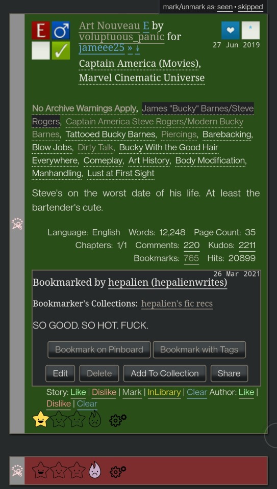

Here are my configured scripts if you’d like to use them instead of tweaking yourself (you need to install both):
FanFictionNavigator
FanFictionNavigator - Colors
Note: Your settings for this script will sync via Tampermonkey but not your data (i.e. fics you’ve liked/marked/etc). If you ever switch between browsers, you’ll need to go to your Ao3 Dashboard and click FFNOptions, export your data, then go through the same process to import it into the new browser.
AO3: Kudosed and seen history - highlight or hide works you kudosed/bookmarked/marked as seen. If you want to use this with FanFictionNavigator, you’ll need to turn off “highlight bookmarks” from the settings under the “Seen Works” dropdown that gets added to your Ao3 navbar or FFN’s colors won’t show. Again, data doesn’t sync between browsers but you can copy it from the dropdown settings. However, it pulls your kudosed and bookmarked fics from Ao3 itself, so that will always show. It's just seen/skipped that doesn't sync:
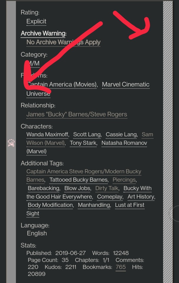
Ao3 download buttons - adds a download button to the works listings page so you don’t have to open the fic to download it. However, it also doesn’t play nicely with FFN’s colors, so I’m using AO3 Review + Last Chapter Shortcut + Kudos-sortable Bookmarks script which also has a download button that works with FFN (a small down arrow next to the author name). The download button doesn’t work as-is from that link, so here’s my tweaked version based off of this comment. You can configure what format you want it to download by default in the script. There’s also a tweak in the comments to fix kudos-sorting, but it overloads Ao3 and you get a “retry later” error for a few minutes when you try to open Ao3, so I don’t recommend it. I don’t know if any of the other functionalities of the script work because I don’t use them, but it looks like there are tweak suggestions in other comments you can try:

I was using Ao3 Replace Words to replace words in fics that bug me but I realized it wasn’t working on mobile, so I’m using zensurf instead which is not Ao3-specific but works basically the same way. If you want to limit it to just Ao3 (so it doesn’t change words on non-fic sites), just add this
// @include http://archiveofourown.org/*
// @include https://archiveofourown.org/*
Above this line
// ==/UserScript==
(function() {
You can // @include other fic sites like ffnet that way too.
AO3: Links to Last Chapter and Entire Works does what it says on the tin, but the creator was kind enough to give me a code snippet to add that makes the “E” (for Entire Work) appear next to all works and add ?view_full_work=true&view_adult=true to the work URL so that I can easily right-click and share to Instapaper and have it be saved correctly (not just the first chapter but the whole work + not the content warning screen for NR/M/E works). Here is the script with this tweak applied:

I think those are the only ones that I’ve done special tweaks for. Here are some others that I find useful that either don’t require any configuration, or should be pretty straightforward to configure and are explained on the script page.
AO3 author+tags quick-search - doesn’t require configuration
Generates quick links from AO3 fics to more by the same author in the same fandom (or character/pairing/any other tag):
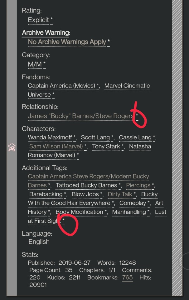
Remove leading spaces in AO3 - doesn’t require config
Removes the leading indents for paragraphs in AO3 works.
Ao3 Only Show Primary Pairing - you have to enter the pairings you want in the script, and you can change how early in the sequence they must appear before the work is hidden. Also works with character tags.
Hides works where specified pairing isn't the first listed. Hidden works show a placeholder that you can click to unhide:

AO3: highlight tags - have to enter the tags you want highlighted, as well as the color you want. It matches case so you may have to enter both “Dog” and “dog”, for example.
Configure tags to be highlighted with different colors. This makes a tag more obvious to your eye when browsing. I use it to highlight things I’m wary of in red so I don’t miss them and start reading a fic I might not want.
AO3: Tag Hider - configure how many tags you want to see before it hides them
Hide tags automatically when there are too many tags. Add hide/show tags button to browsing page and reading page.
AO3 Remove Double-Spacing - no config
Removes awkward double spaces between paragraphs on AO3. Doesn’t smush together paragraphs that have a single line break - it leaves those alone.
ao3 series collapser - no config
Collapse works that are later than part 1 of a series. Leaves a placeholder so you can uncollapse if you want to see it.
AO3 Blocker - no config, but you enter what you want to block from the added navbar dropdown in Ao3
Fork of ao3 savior; blocks works based on certain conditions. I find this simpler to use than Ao3 savior.
FYI there are also style scripts for Pinboard on greasyfork and userstyles.org (this site is slow af for some reason, so be patient while it loads). I use show unread bookmarks more clearly and Modern Pinboard Style (basically a dark mode). Neither require config unless you just want to tweak the settings to your liking. To install to Tampermonkey from userstyles, scroll down to “Install style as userscript”.
I also use these extensions in Kiwi:
Ao3rdr - Adds a star rating system (pictured in some of the screenshots above) to Ao3 works that only you can see. This one will sync your data between devices if you use the cloud sync option, which I recommend so you don’t lose your data if something happens to your device or browser.
Dark Reader - not really necessary for Ao3 if you use Reversi skin, but does make all browser pages dark mode if you want it on sites other than Ao3.
Speaking of Ao3 skins, I have another one set up in conjunction with Reversi that shows all the fandoms on a user’s profile, rather than having to click “expand”:
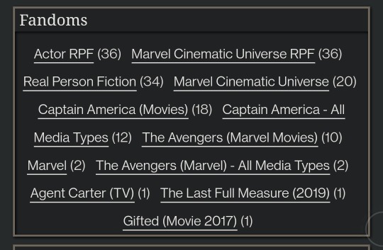
Unfortunately, I can’t remember where I found this. To set it up yourself, go to your Ao3 -> Dashboard -> Skins -> Create Site Skin, fill in the Title (has to be unique), and paste the code below in the CSS box:
#user-fandoms ol.index {
padding-bottom: 0;
text-align: center;
}
#user-fandoms ol.index li {
display: inline;
margin-right: .5em;
line-height: 2.15em;
}
#user-fandoms ol#fandom_full_list {
padding-top: 0;
padding-bottom: 1.5em;
display: block !important;
}
#user-fandoms p.actions {
display: none;
}
Then hit Submit -> Use. There are ways to hide or highlight various elements (ships, characters, blurbs, work stats, etc) on a works listing page using skins on Ao3. This is getting long so I’m not going to go into that, but I’m happy to help if you want to try it. It’s very easy.
Once you have everything configured on Tampermonkey on your desktop, you can migrate it to your mobile device in one of two ways:
Option 1: Go to Tampermonkey settings and change Config Mode to Advanced
Go down to Script Sync and select your preferred cloud service and save
It will ask you to log in to said cloud service
Install Tampermonkey in Kiwi and do the same thing
Wait for it to sync (this can be slow)
It should sync any changes you make moving forward, but again, it’s slow
Option 2: go to Utilities and check all 3 checkboxes under general (include script storage, include Tampermonkey settings, include external script resources)
Either export to your preferred cloud service or
Export as a zip file, move it to your mobile device, go to this same screen and import
I would recommend exporting as a zip for a backup even if you don’t use it to migrate your scripts
You can unzip and upload individual script files (.js) on this page if you ever need to reinstall a single script with your settings instead of all of them
Let me know if you run into any issues and I can try to help! The script writers are also super nice and helpful if you reach out to them. Yay fandom!
#ao3#archive of our own#fanfiction#ao3 resources#fandom#fanfic#tech#Tampermonkey#userscripts#ao3 tips#musette22#I hope you don't mind that I used you for the 'liked author' example ^_^#ditto voluptuous_panic#y'all should read art nouveau it's so good
480 notes
·
View notes
Text
Korean Fast Track 1
This is meant to be challenging. I’ll be posting more resources over time while I do this myself, keep that in mind.The goal is to be around B1, kind of in the sweet spot between A2-B1 or approaching B1 by the end of this. But don’t beat yourself up if you aren’t by the end!
NOTE: The quizzes currently have a response limit because of the site used but I am currently working on replacing them with different links & printouts <3 If you run into an issue and need me to send you the quiz questions, just let me know.
Make sure you read all the additional text here carefully as there’s a whole lot of resources coming!
Things you’ll need:
A language learning app that includes Korean. I don’t care what app you use but it needs to have grammar and vocabulary. Like duolingo, lingodeer etc! You choose. You’ll be doing the light workload on this app.
Flashcard app! Anki and quizlet are the top two.
Basic supplies for taking notes & learning like a notebook and a pen. If you want to do these digitally, go for it.
Hinative or Hellotalk! These are apps/sites to speak with native speakers, ask questions, and get help with pronunciation.
If you do not know how to read the Korean alphabet, learn that before you start this fast track. It can be done in less than three hours.
Talk to me in korean (TTMIK) account
How to study korean (HTSK)
Daily tasks:
One small lesson on your language app, best done in the morning right after you’ve woken up and started your day.
Listen to a short audio in Korean 1-5 times per day. This can be a song or you can watch a whole ass k-drama episode. I don’t care what it is lol!
Vocab vocab vocab! Go through your vocabulary flashcards ONCE OR TWICE every day! use the “learn” option on quizlet for easier learning. (You should be reviewing the vocabulary for that day twice per day, not ALL of your collective vocab.)
Week One Assignments:
Do this in whatever order you’d like, but leave the quiz & end of week assignment for the end. ABBREVIATIONS: HN/HT = hinative/hellotalk
TTMIK Level 1 : All 26 Lessons ! I personally don’t listen to them, I just read the lesson. This is up to you, I recommend taking light notes
HTSK Unit 1 Lessons 1-8 Vocabulary; Put all of the given vocabulary words into your flashcard app / make flashcards and run through them. Use this site to help explain things that you might not completely understand from TTMIK as HTSK is more in depth.
6 pronunciation posts on HN/HT for critique, provide a dialogue typed out so they’re aware of what you’re trying to say.
Watch Test your Korean Listening Level 1 and evaluate.
End of week assignment: Review all of your vocabulary once and take the Week One Quiz !
Week Two Assignments:
Refer back to week one’s assignments if you have issues figuring out how you’re supposed to use certain sites. For this week we are going to be doing the same thing we did last week with TTMIK and HTSK!
TTMIK Level 2 : All 30 Lessons ! Vocab & Notes
HTSK Unit 1 Lesson 9; Vocabulary & Refresh
3 pronunciation posts on HN/HT for critique; provide dialogue.
2 text posts on HN/HTto be corrected by natives; must be at least 4 sentences.
Reply to 5 native Korean’ speakers on HN/HT
Watch Test your Korean Listening Level 1 and evaluate again.
Listen to your favorite Disney song in Korean
Watch 12 Grammar Points In One Sentence and take a few notes.
Read This Post ; Take notes & Create a flashcard set (learn them)
End of week assignment: Review all of your vocabulary, refresh on any grammar you’re uncomfy with Week Two Quiz! (this one is tiny)
Week Three Assignments:
Get ready to cram some phrases and such in this week. This week is all about progress with speaking. You’ll be focusing on learning how to create sentences that make sense & gathering the necessary vocabulary and grammar to do that is a train wreck. Buckle up.
TTMIK Level 3 : All 30 Lessons! Vocab & Notes
HTSK : Only used to clarify what you don’t understand with TTMIK
Korean Slang Post : Make flashcards and learn
Korean Ordering Post : Make flashcards and learn
Write down everything you do one day (e.g. watch tv, go to the bathroom, cook) you need at LEAST 10 things. Now write it in Korean. Learn these phrases and words.
Post 5 pronunciation posts to HN/HT for critique
Reply to 15 natives in Korean on HN/HT
Post 7 text posts on HN/HT that must be 4 sentences or more. Try to use the vocabulary you’ve learned this week. If you don’t know how to say it/write it, look it up and add it to your notes and flashcards
Make a flashcard deck for the food you commonly eat.
Watch Test Your Korean Listening Level 2 and evaluate
Watch 30 Fun and Useful Korean Phrases and learn what you can.
End of week assignment: Review all of your vocabulary, refresh on your grammar. No quiz yet! It’s on the way!
Week Four Assignments:
Home stretch for this damned thing. It might be a little intense but it’s necessary for progression. Be prepared to do a LOT of practice. We’re once again heading towards sentence building.
TTMIK Level 4 : All 30 lessons. Vocabulary & Notes.
TTMIK Level 5: Lessons 1-5. Notes.
HTSK is used for clarification on stuff you don’t understand & vocab if you need it.
Post at least one text post to HN/HT per day in Korean with at least 3 sentences. Adding a picture gives it extra flavor keke
Reply to at least 3 people per DAY on HN/HT in Korean.
One pronunciation post per DAY on HN/HT with dialogue for critique
Watch an episode of something or a korean youtuber in korean without subtitles, you don’t need to pay attention but it needs to be in the background. Do this once per day.
Review vocabulary and brush up on any grammar you’re having trouble with.
Watch 30 Advanced Korean Words and learn them.
Try to “test unlock” levels on duolingo/lingodeer/whatever app you use to see how far you’ve advanced.
No quiz yet! It’s on the way!
ADDITIONAL RESOURCES:
They’re not super aesthetically pleasing, sorry! I don’t have time to spend an hour per worksheet right now OTL. I’ll make more and keep updating this post! <3
Week One Korean “Write in the blank” Worksheet
Week One Korean Vocabulary Worksheet (KEY)
Week One Korean Worksheet 2
Week Two Anagram Game! (Scroll down! The other two have some glitches because of the Korean uwu)
I also recommend This Study App ! I'll be uploading all of the notes, PDFs, etc here :D This way even if you can't print it out you CAN annotate the PDF, have my flashcards, notes, summaries etc!
Here’s the Study Group Link to the App mentioned above! All notes, flashcards, etc will be there as resources for everyone. I recommend making your own flashcards on quizlet/anki/here too but if you don’t have time to make all of them, I will be making resources available
QUIZLET FLASHCARD SETS (in progress, will update over time)
I found THIS PDF of TTMIK levels 1-9 :D If you can't study online daily, download this so you don't have to download ALL of them individually
If this is too difficult don’t push yourself too hard. Don’t be afraid to search tumblr for fun stuff too! This is supposed to be a fun challenge !!!
Make sure you come back to my blog for all the post updates for more material like games, worksheets, flashcards, etc !
#korean language#korean#koreanlangua#langblr#languages#langlearning.challenge#juvisthings#juvistuff#korean vocabulary#korean grammar#language challenge#studyblr#polygl#studying#studytip#KORFASTTRACK#Korean fast track
122 notes
·
View notes
Text
Nightwing 79 Review
i said i would and i will. i did like this issue! not as striking and attention grabbing as 78, but i think this issue was meant to be a foundation one, laying out the groundwork for the future. overall, pretty good. also there wasn't enough bitewing. as promised, overly extensive metaphors and me reading too much into things under the cut
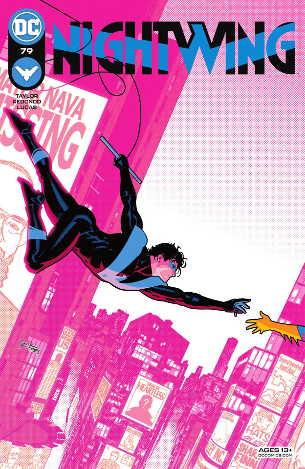
i know i've talked about this cover before, but this particular thing is oddly important to me, so i'll talk about it again
this is me, once again screaming about how artists put nightwing in traditionally feminine poses and how every time i see it i just get whiplash. i mean, true, the main reason why is because nightwing is a so often sexualized character, and putting him in these poses just increases the objectification, which is a goal that dc producers have. but there are very few popular male characters that do this. the only one i can think of off the top of my head is deadpool, but that was so obviously a critique and a way to make fun of the media industry. when they draw dick like this, they’re being serious. they’re putting him in appealing poses meant to show him off, and that’s something that’s traditionally only been done to women.
it's a very direct and very loud breaking of traditional gender roles in media, especially for a character as high-profile and historic as dick grayson. colour also plays a factor in this. the entire background is pink. i was absolutely shocked when i first saw it, when the teaser came out, because i cannot think of any comic book covers of male comic heroes this high-profile where pink is even just prevalent in the cover, let alone the majority of the cover. the pink does look beautiful: it offsets and highlights the black and blue of dick's suit gorgeously, but does it with more finesse than orange or red. but the fact that the stylistic choice was made to accent and draw this cover with aesthetic and beauty in mind, completely ignoring traditional hard-set gender rules in art, was a conscious choice and one i wholeheartedly support.
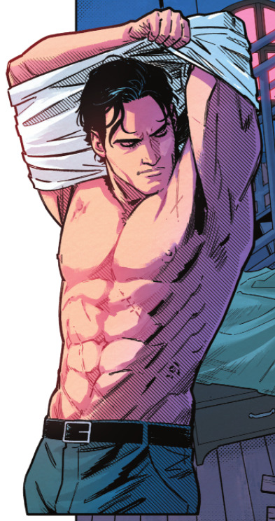
just another example of the sexualization i was talking about. i remember seeing harley quinn in this exact pose in suicide squad.
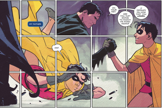
so far, taylor's been pretty dead-set on bringing alfred to the forefront of importance in this series. he wants people to know how much he loves alfred's character, and how much the butler meant to dick growing up. he was dick's father too. but what i adore is how taylor managed to stress alfred's importance in a way that didn't insult or belittle bruce.
this is one of the best bruce and dick interactions i've seen, and it's done in one simple interaction. in this, bruce is tough and harsh. he knocked dick down hard, but then he reached a hand down and helped pull dick back up. let me analyze their dialogue for a minute
on your feet: this is bruce telling dick to get up. he's trained dick, he knows what the younger boy is capable of, he knows his limits, and he knows what dick can do. this is bruce telling dick i know you're strong enough to get up, so get up and prove me right
are you just going to knock me down again?: surface-level, it looks like dick's complaining. he doesn't like bruce's rough training, and he's tired of bruce knocking him down. but look at his face in this. he's smiling up at bruce, knowledgeable and a little hopeful. he knows that bruce is doing this to help dick better himself, he's completely on board with the rough training, because they both know the rewards are incredible. also, he's teasing. he's bantering with bruce. there's an ease in that joking statement, one that belies affection and intimacy. they've only known each other for a little bit, but they're already slipping into a close familial relationship.
it depends on how fast you learn: this is bruce bantering back. this is bruce not being a stoic, unfeeling asshole. instead, he's shown with the dry humor that a good batman writer knows is a staple of the character. he's teasing dick, telling him he'll basically whoop his ass if dick doesn't learn fast enough. it's incentive for dick to train harder, while also being lighthearted enough to tell dick that believes in dick and doesn't want him to push himself too hard.
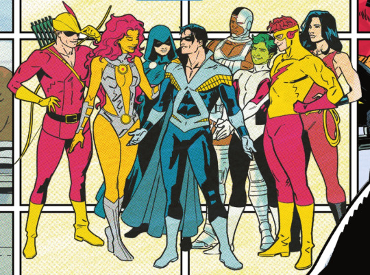
gosh i love the titans. also it looks like wally's staring at dick's ass.
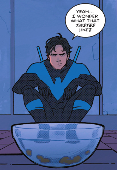
this was cute. a prod at dick's silly and playful sense of humor, while not dumbing him down for the sake of a laugh. instead, he's joking about food, which is stuff everyone jokes about. this is the kind of stuff that'll actually make me laugh, instead of just making me vaguely uncomfortable.
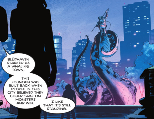
bludhaven's almost always portrayed as a cesspool of a city. and to be honest, it really is. but this panel gives the city a meaningful history, while also giving us a reason for why dick moved there.
it talks of a time when people still thought they could beat the monsters. that if they fought hard enough, they could win the fight. it was a tentative hope that you could always overcome hardship.
dick's little "i like that it's still standing" shows how he still believes that, despite what the rest of the world thinks. despite everything that he's been through, dick is still tentatively an optimist, and believes he can fight the monsters of the world and win. it's a beautiful testament to his character, and i'm like that they added his signature element of hope back in. it used to be what he symbolized as robin, and despite his growth and character arc from robin to nightwing, this is one aspect of robin that i'm glad nightwing still has.
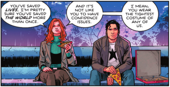
remember when i said "things that make me vaguely uncomfortable??" yeahhhh,,,,,,,,,,,,,,
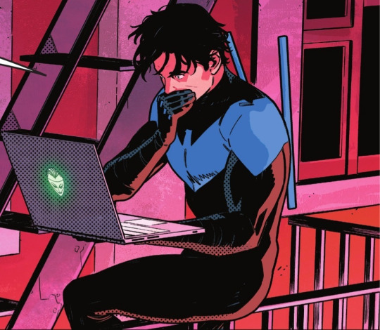
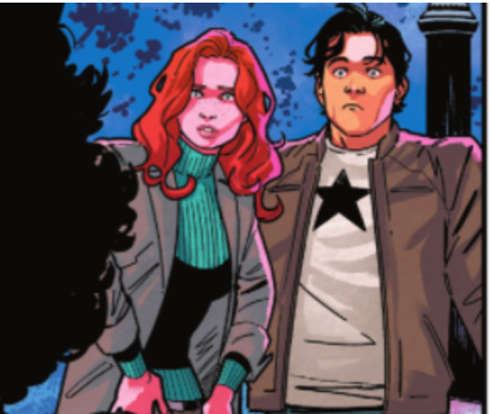
Shooketh Dick: A Sequel
(the expressions in this series are just,,,,on point)

this was an incredibly sweet and kindhearted thing for dick to do, but i found it kind of,,,,,,,,desperate? maybe that's just me, but let me explain.
dick's suddenly a billionaire, and he has entirely too much money that he knows what to do with. it's also alfred's money, what the man left to him, so dick forever links it with alfred. in addition to that, he's back and bludhaven and looking at it with "fresh" eyes. (at least, from a different point of view since he got shot in the head. then mind controlled.) he's desperate to do something with the money and he's desperate to help the people around him that so obviously needs up, so he comes up with an on-the-fly solution that's a little impractical and a little crazy, but it still helps and still does some good.
to me, dick seems a little lost. he hasn't completely found his balance yet, and he's trying to do things that will. he tries charity, because that's what bruce did and it's what he knows, even though he admitted that he always thought bruce could have done more as bruce wayne than batman.
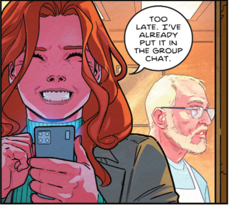
they have a family group chat guys yall were right.
also, do i think that dick would ever actually get his wallet stolen?? no way in hell, he’d notice someone getting ready to pickpocket him a mile away. but i suppose it’s important to the Plot.
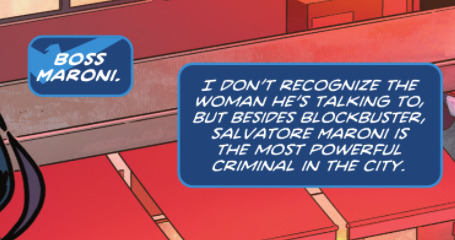
okay this is getting interesting. first blockbuster, now maroni (+ the weird heart stealer guy). i can officially say that i am intruiged
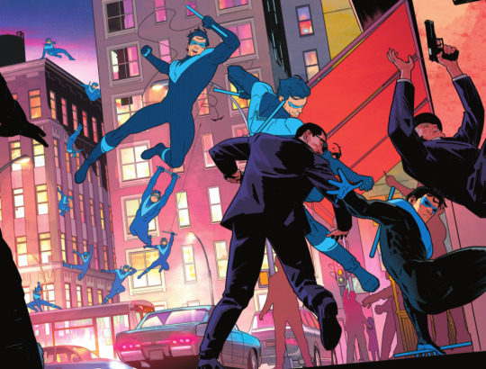
this particular artistic quirk is shown a lot in this issue, and from this art team in general, but i feel like this panel is one of the best examples of it. it was stunning enough to take up a full page, and it’s well deserved.
the way they show dick moving is absolutely brilliant. as a reader, i like seeing these smaller versions of dick getting clearer and in more detail as they come closer to the screen. not only do they show depth in the picture beyond what a simple 3 dimensional piece of art does, it also shows the passage of time.
in addition, it showcases dick’s skill. dick spots these mobsters running after a group of petty thieves. he then, and follow me here, leaps off the roof of one building feet first, springboards backwards off the side of the adjacent building with his feet, gracefully continues his backflip, rights himself, shoots a line with perfect timing: just in time to soften his landing but not slow him down, execute said landing on top of a moving bus, keep running on the moving bus without missing a beat, shoot his grapple, use the grapple to swing, use the swing to build up momentum, then use the momentum to deliver a powerful blow to the mobsters. and he did all that fast enough to catch up with the mobsters, even though he was a ROOFTOP OVER.
d a m n s o n
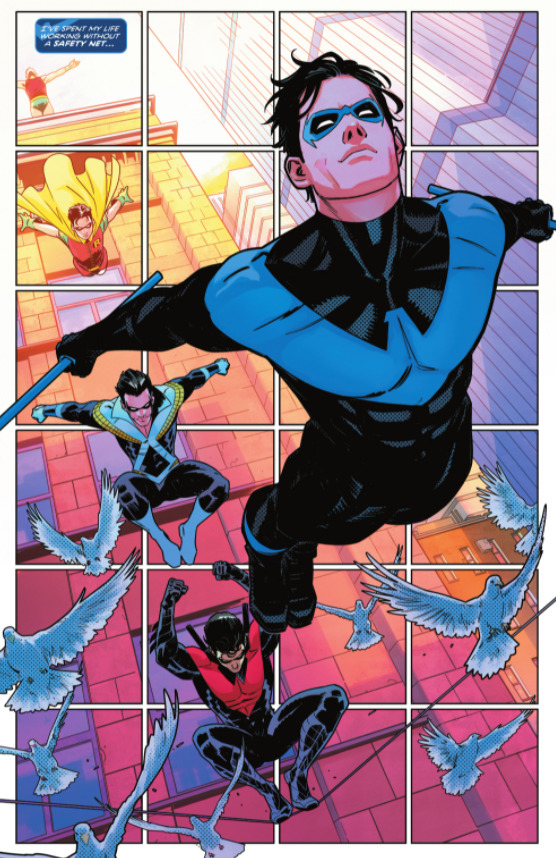
this panel, the very first in the issue, is also another example of that art style, but a little more distinctive. i love the way they showed dick’s different costumes through the ages, along with him simply growing up. it’s a little heartbreaking, but a lot uplifting to see how far he’s come. thank god he got rid of the red. now all we need is the fingerstripes, and we’ll be golden
discowing my beloved. also i can’t clearly see discowing’s hair but it definitely looks like it’s pulled back. it looks like he put it in a ponytail. guys. guys. dick had a ponytail omg.

he’s having a Hero Moment
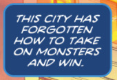
are you talking about the city, dick, or are you talking about you? the kgbeast, the court, the joker. dick fell to each one of them, no matter how hard he fought. he won in the end, eventually and with his family’s help. but i think he’s feeling a little low, a little defeated right now. it’s almost like he needs a win, he needs to feel victorious, he needs to feel like he helped someone (hence the food and the hotel room), just because he needs to remember what it feels like.
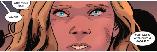
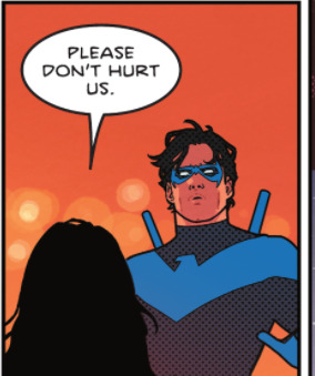
these lines were supposed to resonate with you, and goddamn they did.
i looked at it from two ways. first, it’s the girl asking, begging nightwing not to hurt them. bludhaven doesn’t know dick the way gotham does, they’re still a little frightened of him. this child was brave enough to step in front of all of the other hurt and homeless kids and ask, to a strange man in a mask, if he was going to hurt them like the other men had. it’s heartbreaking, but commendable, and an echo of the city itself that dick’s decided to protect. they’re bloody and broken and terrified, but still gritty and brave enough to stare what they fear in the eye and ask it not to hurt them.
second, it’s dick seeing the question reflected in himself. recently, he got shot in the head and lost all his memories. while i think that the way ric reacted was a perfectly valid and human response to the situation, i think dick still regrets how callously and rudely he treated his family. then, he was manipulated by the court of owls, then he was brainwashed with a magic crystal by the joker. dick does have a guilt complex. it’s not a big as bruce’s, but it’s there. and right now, with this girl begging her not to hurt them, dick is probably thinking about all the times he hurt people, in control of his own actions or not, bc he “didn’t have a heart.”
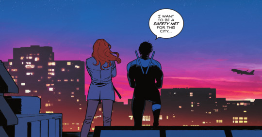
little ambitious don’t you think, dick?
also just look at the sunset colours loOK at the they could not make this any more obvious oh my godddddddddddddddddddddddd
in conclusion, i need more of her
#dick grayson#nightwing#nightwing 79#nightwing 79 spoilers#dc#dick grayson meta#nightwing meta#nightwing 79 meta#dc meta#river thinks too hard
129 notes
·
View notes
Text
Art Advice #4 - A Beginner’s Guide to Digital Art
Hi all!
This weeks entry into my Art Advice tag, where I offer various advice for artists of any skill level, is about digital art! Now, I am by no means an expert at digital (I’ve been doing it for nearly 8 years at this point and that is almost entirely self taught), but I have picked up a few pointers in that time which will hopefully help anyone just starting out!
(this blogpost is a little over 2000 words long btw)
A Beginner’s Guide to Digital Art
I know that the world of digital art has changed drastically in the 8 odd years since I started, but I’d still say that some of the options I started out with will be just as good for anyone who’s starting out now!
As always, I’ll be splitting this into sections to make it easier for you to navigate this post!
Part 1 - Equipment/Hardware
There are a lot of drawing tablet options on the market at the moment, and I’m not going to pretend that I know anything about half of them lol. But I think for a beginner, don’t worry about going for the most expensive option, even if the reviews are really good or your favourite artist uses it, especially if it is way above your budget!
An important thing to know is that there are two types of tablet. One is the plug-in kind. These are essentially a pad which you plug into your laptop or computer and draw on that whilst looking at the screen (they basically work the same way as a plug in mouse works). The other kind is the screen variety, which is a lot more like what most of us know as ‘tablets’ nowadays. And you draw directly onto the screen.

(a plug-in vs on screen tablet, both from Wacom)
Now, as for choosing between these, it is honestly a personal choice. But I’d say if you’re just wanting to try digital and you’re on a budget, a plug-in tablet can be really useful since it gets you used to the mechanics of what digital is like, and they are often significantly cheaper than the screen alternatives. I would say that plug-in tablets are a big learning curve, especially if you’re used to doing traditional stuff, but I do know a lot of professional artists who still use this kind of tablet when doing their work, so if it’s something you can get used to I would definitely consider it! Also, they’re often a lot more portable than some screen tablets! The first one I had was a Huion (a model so old that I can’t even find a link to it now lol), and I also know that Wacom are a well known brand that do some decent plug-in tablet. I’d recommend you do your own research on other brands and options, though!
Screen tablets are often a lot more expensive, but if you’re used to traditional art, they are a lot easier to get a handle of! But I know if you already have something like an iPad, or other general use tablets, then they offer apps that you can use to draw on (as well as things like the Apple pen, or other stylus’). The big difference between using these general tablets and ones specifically designed for drawing is pretty much purely a personal choice. I personally prefer the bigger screen of my XP-Pen tablet, along with a special screen protector that removes the shininess of the tablet screen and makes it feel more like ‘paper’ over when I used a general use tablet it draw. But if you already have an iPad, or something similar, then it’s honestly a really great starting point!
I think it’s important for me to mention that you don’t need fancy equipment to be an artist. The incredible Elicia Donze has revealed countless times how she has very basic equipment but still manages to produce the most stunning artworks! All you really need is some kind of drawing apparatus and a lot of patience lol! Getting good at any kind of art takes a lot of time and effort, but I would definitely say it’s worth it when you’re able to look back at your progress!
Part 2 - Software/Drawing Programs
Much like with the hardware discussion, choosing which program to use is entirely down to personal preference. I personally have never really liked Photoshop purely because it’s really complicated, but I know so many artists swear by it.
I think the main aspect to consider when you’re starting out is whether you want to pay for a program. Software like Photoshop, Clip Studio Paint and Procreate are some of the popular ones I hear about a lot of people using, but all require you to purchase or subscribe to them. So if you’re young or on a very tight budget, I’d honestly recommend the free alternative versions of these, such as Krita (Krita is quite a large program, but it has a lot of really awesome features and is very similar to Photoshop!), Gimp (this one is similar to Krita, but has slightly less options, I’d honestly recommend Gimp for anyone who does photo editing though!) or FireAlpaca (this is the one I use, by the way and it’s a pretty simple program, but has a lot of fantastic features and is perfect for how I work!). These don’t have as many features as some of the paid alternatives, but I honestly think all you really need to start digital art is some kind of ‘canvas’ and set of brushes!
Another great free program for beginners I’d recommend is MyPaint, which is great for doodling and just getting used to how digital art feels in comparison to traditional! It also has a bunch of ‘traditional style’ brushes, to make it look like charcoal or watercolour (which I’m sure the paid alternatives have too, but it’s always better when it’s free, I find lol...)

(this is an example of a drawing I did on MyPaint using the ‘charcoal’ effect brush!)
Most of the sites are pretty self explanatory, with sections dedicated to different brushes (I’ll go into the types of brushes later on in this post btw!), adjusting brush size, shape and opacity, a colour wheel, etc. You also have a section dedicated to ‘layers’ (another thing I’ll go into more detail later), and various ‘filters’ and editing options and effects you can add to your work to make it more interesting!
I’d really just recommend playing around with programs until you find your one!
Part 3 - The Pros of Digital Art!
I realise this section should probably earlier in this blog post lol, but I kinda wanted to go into what digital art can achieve in comparison to traditional art, and how beginner artists can utilise this!
I definitely didn’t take advantage of certain aspects of digital art when I first got into it, and they’re things that would have definitely made my life a whole lot easier lol!
Digital art allows you to tweak drawings as you do them. So if you accidentally drew the eye too far to the right, then you can easily move it to the right place. (I usually do this by selecting whichever area is wrong, cutting it out and then pasting it into a new area... And yes, there is probably a better and quick way of doing this but...I haven’t found that way yet lol...). And I honestly think that this has allowed me to look a lot more at a reference image in order to figure out where I’ve gone wrong with a drawing! Whereas with traditional art, I usually spend so long trying to get an eye right, that even if it’s slightly in the wrong place, I don’t want to completely redo that section. Digital allows you to completely rub out sections without leaving indents, which is honestly such a saving grace!
Another pro of digital is the Undo/Ctrl Z function! This means you can easily go back to before you made a major mistake with just a click of Ctrl Z... Though I have to say that this function has honestly ruined traditional art for me... Oh what wouldn’t I give for a real life Ctrl Z... But yeah, this is a great part of digital art and definitely something you will grow to love lol!
Another great thing about digital is that it allows you to flip and turn a canvas as you’re drawing on it. I spent a lot of time trying to turn my tablet around in order to draw certain parts of a piece before I realised you can turn the canvas itself without having to move yourself or your tablet!
Layers are another part of digital that can be super useful, and I have to be honest but I don’t really use them a lot. I know a lot of artists create layers for every section of their artworks (so, one for the linework, one for colouring, a separate one for the background, etc etc...). And there’s something really great about being able to paint without worrying about smudging into a previous section of the painting. This works well for my work since I do a lot of bright backgrounds. I also often create a lot of ‘versions’ of my works, so it’s useful to be able to change the background without affecting the main figure of the piece! (I have to say that I often work in one big layer when I’m doing paintings, just because I like how it feels more like ‘traditional’ art that way, but layers are such a brilliant tool, and definitely something you should play around with!)
The eyedropper tool is another one that is really useful! Although I never colour pick from my reference photos, I know some artists find this useful when they were just starting out (especially if you’re not sure what colour to make shadows or how to mix skin tones, etc etc). The eyedropper basically means you don’t need to mix your colours every time
Part 4 - Just some other things I wish I had known about when I was starting out lol...
This last section is just dedicated to a few things that I would have liked to have known when I was just starting out all those years ago.
First one is fluffy/textured brushes!
I spent most of my art life from 2013 until 2016 using ‘round’ brushes which are notoriously hard to blend with, so I’d recommend either downloading some fluffy/textured brushes (DeviantArt was where I got mine from a few years back, but there are probably other places you can get them for free too!) to your program of choice, since most of the programs I’ve used haven’t had fluffy/textured brushes as pre-set.
I may make another post about how I blend in my artworks if that’s something people would be interested in?
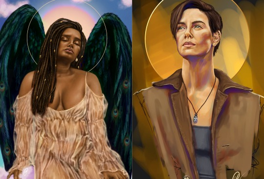
(this is an example of textured brush blending vs round brush blending... I usually opt for round brushes for rougher blending styles and the textured brushes for more smooth and ‘realistic’ blending... for a lot of pieces, though, I use both brushes (the round brushes are good for details!) in the same way that you use different sized brushes for real paintings!)
The next thing I wish I’d discovered earlier is the Brush Stabiliser option. Some programs may do this automatically, but the one I use (FireAlpaca) requires you to manually change the amount of stabilising you have on your brush. This is particularly useful if you want to draw neat lines or straight lines (the stabiliser essentially slows down the ‘ink’ as you’re drawing). I only recently started using the stabiliser, and although I still like having it mostly turned ‘off’ for doing sketchy work, it does make doing line work a lot easier, and also gives pieces a more polished look!
Next advice is to explore all the options you can in whatever program you use!
I feel like with certain programs, you can get overwhelmed by choice and you end up just using a few of the functions. But I’d really recommend just playing around with these programs, trying all the filters and editing options to get used to how the program works. You can often find interesting ways to adjust your artworks this way! In a way I’d recommend this way of working more than finding tutorials made by other people... Unless there’s a specific function you want to learn how to do, just having fun with digital art is a major part of it’s appeal to me!
~
There are probably a lot of other options I could go into, but this is already over 2000 words long, so I’ll leave it here for now lol! (I may do a part 2 though so... keep a look out for that!)
As always, if you have any questions to things I’ve said here, or are just looking for more advice, don’t hesitate to message me!
And if you like my work on here (art & blog posts) feel free to support me on my Ko-Fi! <3
#art advice#digital art#art advice for beginners#digital art for beginners#artist advice#digital art tips#artists on tumblr#just want to say again that i am not an expert at this at ALL lol#i just want to offer some really basic advice to anyone interested in starting out with digital!
102 notes
·
View notes